Case Study: Product Marketplace Launch
About the Project
Marché is a carefully curated product marketplace by Oeuf NYC, featuring over 50 decor pieces, toys, and sustainable goods to complement the brand’s furniture collections. We aimed to create a seamless shopping experience where customers could discover thoughtfully selected decor and “shop the room”.
For the launch, I developed branding, photography, and e-commerce strategies, ensuring a cohesive visual identity and integration to the online store. The debut was highly successful, driving strong customer demand and sales performance.
Below is a case study outlining the development of Marché, from concept to launch, covering branding, photography, and e-commerce strategy.
Role: Art Direction, Graphic Design, Photography Direction, Photo Retouching
Tools: Photoshop, Illustrator, Figma
Client: Oeuf NYC (in-house project)
The word Marché means “marketplace” in French, making it a natural extension of Oeuf, a French-American brand. To visually reinforce this connection, we were inspired by classic French market awnings featuring bold colors and stripes.
Inspiration
For the Marché logo, we used a red, italicized variation of Libre Baskerville, which is Oeuf’s header font. This choice maintains a strong visual link to the brand while giving Marché its own distinct identity.
The Marché Mark
Lifestyle Photography
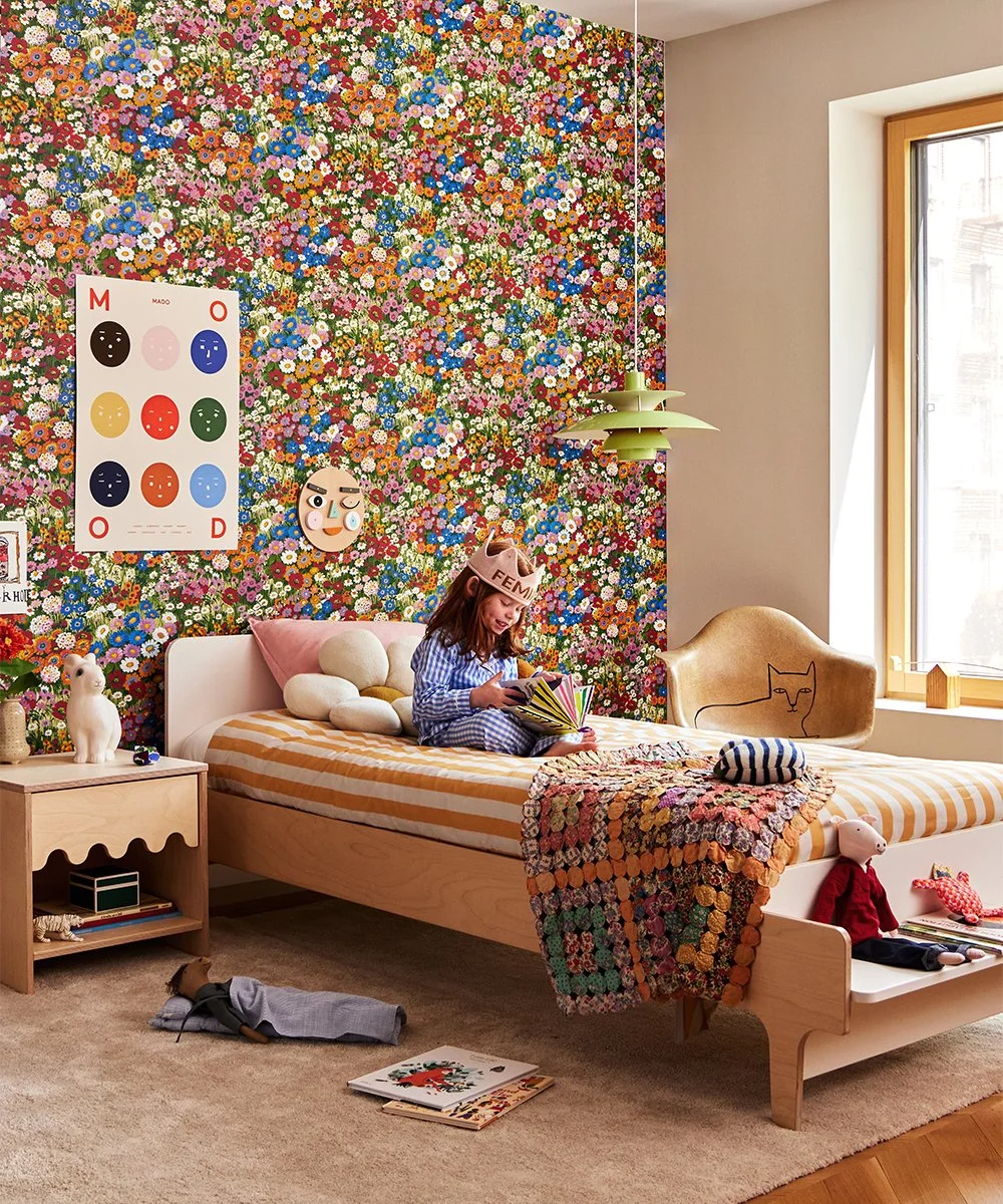
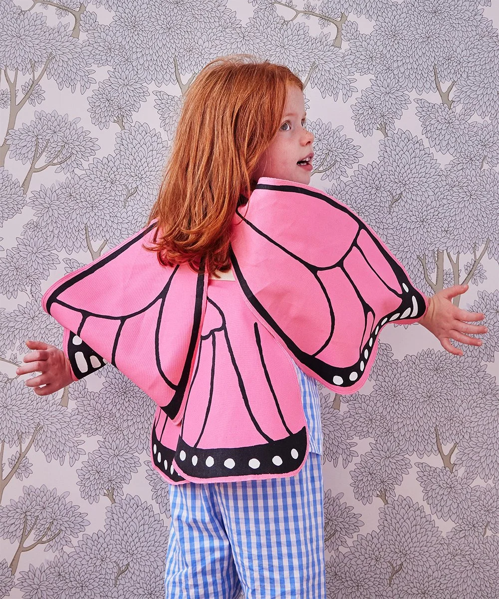
We styled over 50 Marché products in 5 different room settings showcasing Oeuf’s furniture so customers would be inspired to “shop the room”. Photography by Kate Jordan.
Video footage promoting Marché used on our homepage, for ads, and on social networks.
Video shot and edited by Kaitlin Kemp
Web Product Images
This product imagery was shot against a gray background to maintain consistency with Oeuf’s existing decor offerings, ensuring a seamless shopping experience.
A red Marché badge featuring a heart was added to distinguish collection items, creating a recognizable visual cue across the site.
To further emphasize the French influence, we incorporated “le” into the naming convention, adding a playful and charming touch that aligns with the brand’s identity.


